RAKURO
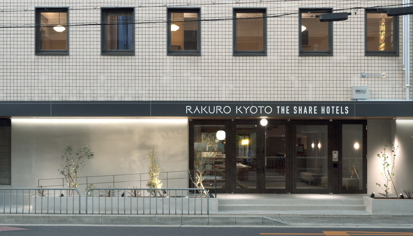
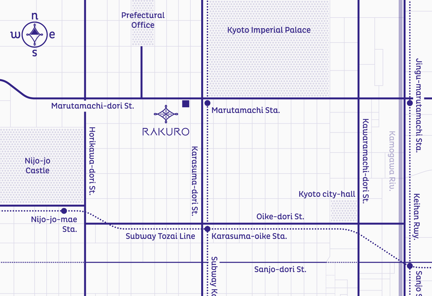
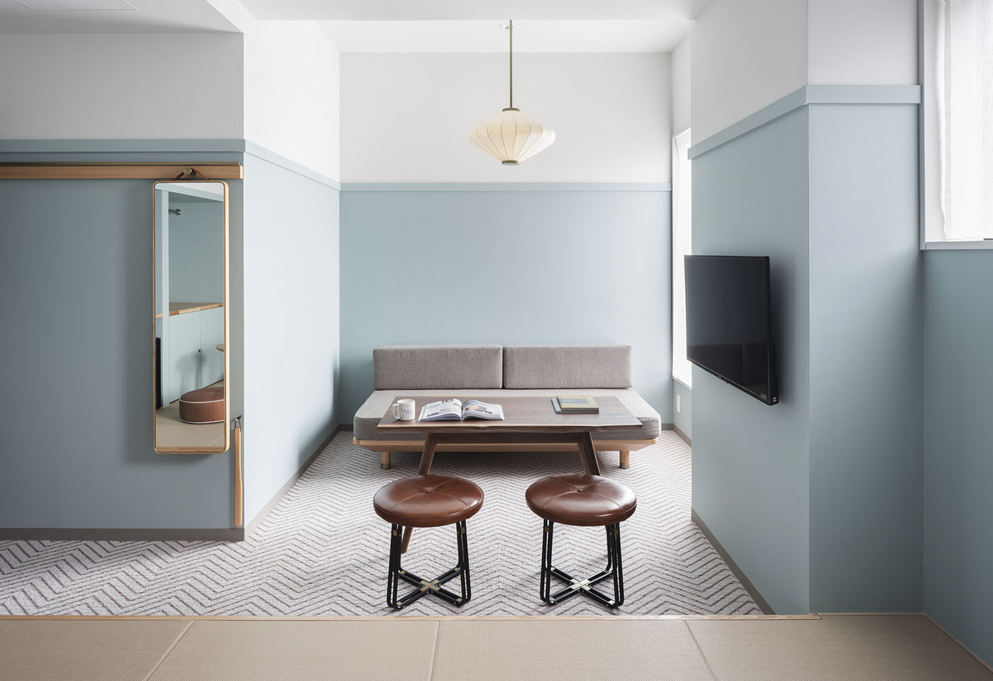
京都御苑近く、丸太町通に面するオフィスビルをリノベーションした株式会社リビタによる新しいシェアホテル、RAKUROのコンセプトは、北欧的心地良さの感じられる空間をベースに、街歩きしながら京都と出会い、深く知っていく旅。ホテルが乱立する京都で今求められているのは、格好良さよりも新しい心地良さではないか…。工業的精度感を求めた通常の2次元的なサインではなく、館内内装で広く使用されている天然素材と調和し、思わず触ってしまいたくなるような、愛着の湧くコミュニケーション媒体としてのサインを生み出せないだろうか、という発想からアイデアを展開しました。
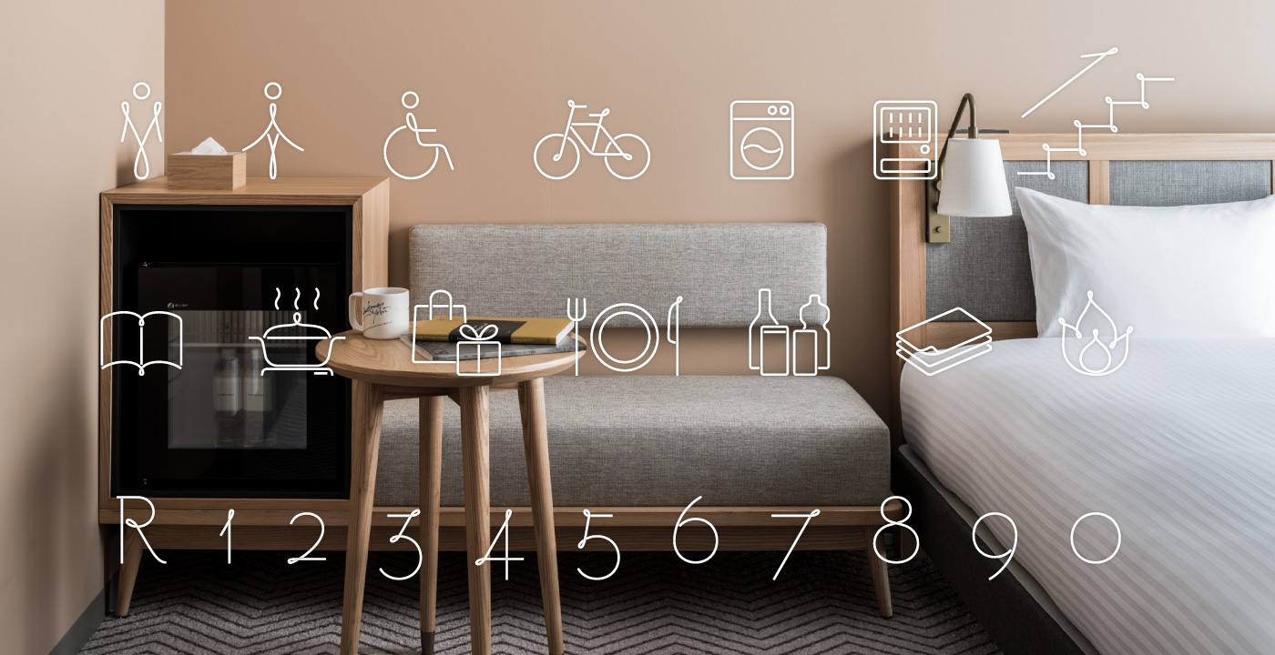
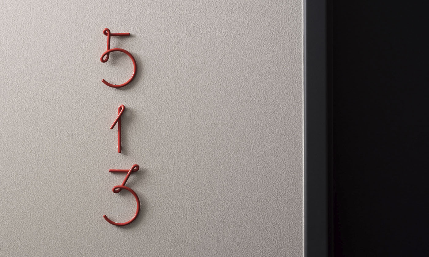
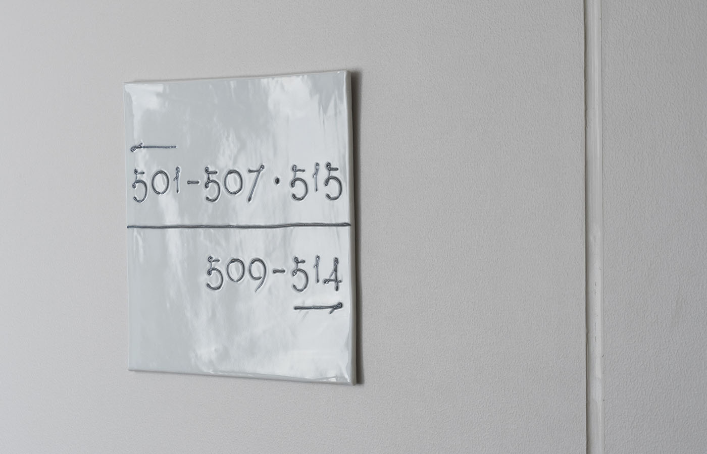
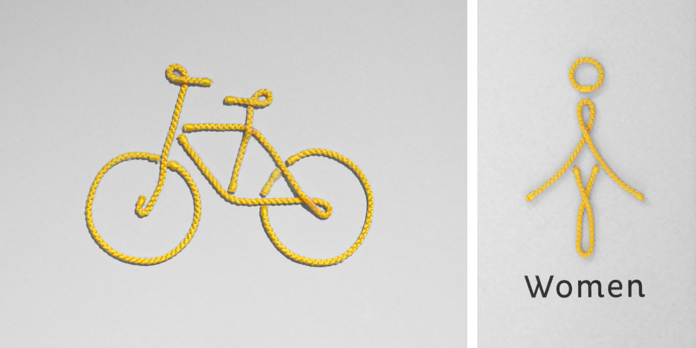
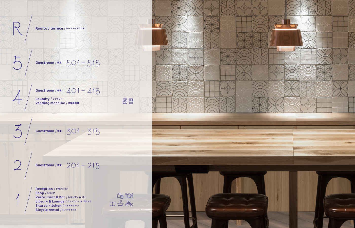
洛中の格子状市街地を形成する大小の通りは、車も通れないほど細い路地から小路、大通りへと段階的にスケールが拡大したものですが、そのフラクタル構造は、糸が束なって紐となり、さらに縄や綱へと形態変化するといった、日本的なものの成り立ちを連想させます。道のようで糸のようでもある「細く柔らかいもの」でグラフィック全体を構築し、しなやかさと繊細さ、心地良さを共存させることができる世界観の構築を考案。共用部ピクトグラムには職人の手による京組紐、客室番号には曲げの施された金属線材をサイン化したオブジェクトを設置し、客室誘導サインには、京都の伝統工芸士 高島慎一氏のいっちん技法による手書き文字によって表現するなど、人の手跡が感じられるサインシステムを作り上げました。
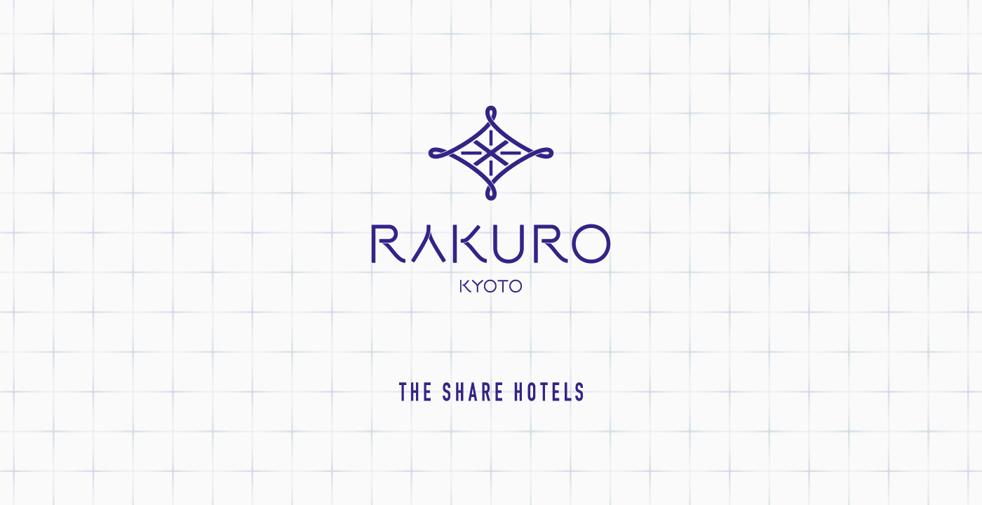
館内、印刷物、様々なグッズで使用されるロゴマークにはホテルの持つ様々な背景や価値を濃縮させました。水平と垂直のラインは南北、東西にめぐり交わる京都の大通りや路地を表現。中央の「×」は「伝統と最先端」「宮廷文化と庶民文化」「日本と海外」など古来より異なるもの同士が掛け合わされてきた京都でさらに「地元の人と旅の人」が交わる場所に、との願い。外周ループ形状は「きらり」と光る発見、交流、思い出、価値を生み出す場所や、「街歩き」を連想させるコンパスを示唆しています。
Located close to the Kyoto Imperial Palace, the concept behind Rakuro – a new type of “shared hotel” experience housed in an office building facing Marutamachi street and fully renovated by ReBITA Inc. – was a feeling of Scandinavian comfort to serve as a base for guests to explore and discover Kyoto on foot – providing for a more profound type of travel. So many hotels are springing up in Kyoto these days, and in the midst of all this development chaos what the city is crying out for is a new type of comfort rather than just a cool design. At Rakuro we chose to eschew the traditional 2D approach of industrial precision when it came to signage – instead we focused on harmony with the natural materials used widely throughout the hotel, and a tactile feeling that encourages touch, resulting in a deeper sense of communication.
The central part of Kyoto is a grid of broad boulevards crossing narrow streets and alleys, some of which seem too tight for cars to pass through. The fractal structure of the city is expressed in the thread design used in the signage one encounters at Rakuro. These threads are bundled together to form cords, which are then further combined to form ropes – an evocative trope in Japanese design. The graphic expression using thin and flexible materials, supple and elegant – signify a feeling of comfort. Selected shared areas use a pictogram motif made with strings hand-braided by a Kyoto artisan, and individual room number signage is depicted using metal wire looped to form numbers. Kyoto-based ceramicist Shin’ichi Takashima created the wall plaques to guide guests towards their rooms, using an adaptation of the icchin slip-trail technique. The overarching concept was for visitors and guests to feel the human hand at work across all signage at Rakuro.
The logo used across the hotel interior, printed matter and a variety of Rakuro goods is imbued with elements of the hotel – a collection of backstories and unique values. Horizontal and vertical lines represent the north/south and east/west streets, alleys and boulevards. Kyoto has been a special place where seemingly contradictory concepts intersect – tradition/modernity, palace grandeur/civic culture, Japan/overseas – as indicated by the X design in the center – symbolizing the hotel, and the city as a whole, as a place for visitors and Kyotoites to meet, interact and share. The loops on the edge of the logo stand for the excitement that comes from discovery, interchange, remembrance and values – as well as a compass to guide visitors around as they discover Kyoto on foot.
Client
ReBITA
Year
2018